

Remarkable graphic design brings a concept to life through communication, a customised approach and an element of surprise by employing current and upcoming visual design trends.
We’ve witnessed firsthand the significant changes our clients have faced in terms of how digital media and design drives a great deal of consumer behaviour.
Irrespective of your business’s sector or purpose, you’re at the forefront of having to understand these changes and trends, all while marketing and growing your business. And with a sea of visual information in the market, we saw an opportunity to present some of our favourite graphic design trends and how marketers can utilise these in their branding and marketing communications.
Creating brand-loyal followers can be achieved through a considered mix of compelling messaging and striking visuals.
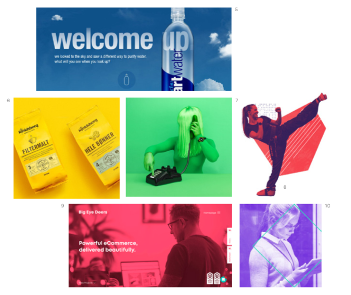
Neon Gradients
Gradients have been around for a long time and traditionally used specifically by technology companies. Now we’re seeing all kinds of businesses in different sectors adding real flair to their brand with rich, eye popping neon gradients.
They’re zesty, distinct and versatile, giving brands a futuristic, over-the-top vibe. Check out the examples below. They’re full of rich-toned depth and sunny psychedelia.
Why not heat up your current branding and give it what it deserves: some exciting neon gradient action!

Monochrome
Going monochrome is a surefire way to make your marketing material iconic and highly distinct in a cluttered market. From a branding perspective, it’s no wonder companies are embracing this trend as it helps associate a brand with a specific, memorable colour.
Picking a colour palette for design projects can be a real pain in the bum. Building a monochromatic palette out of shades, tones, and tints results in a versatile spectrum with colour options for every part of your design. It creates a harmonious, visually cohesive look.
Monochromatic marketing material doesn’t draw attention to itself, but lets your content really shine.
Companies are embracing this trend as it helps associate a brand with a specific, memorable colour.
Muted Vintage
In the saturated universe of graphic design and marketing, what’s a guaranteed way to make your material stand out? Desaturate it, of course! We love graphic design that feature soft, muted colours in unusual combinations.
There’s no shortage of colour in any of these projects. The main colours just don’t dominate the graphics like some of the trendy colours of the past. After years of loud colour palettes, these muted desaturated colours can be used by brands to signal a move towards the future.
We love graphic design that feature soft, muted colours in unusual combinations.

Thanks to Sir Isaac Newton, we understand that colour comes from light reflection. As designers, we use colour to help us communicate, and get our message across.


