
Nganampa Health Council (NHC)
")
Bringing community health stories to life through thoughtful, culturally grounded design.
Nganampa Health Council (NHC) is an Aboriginal Community Controlled Health Organisation operating on the Aṉangu Pitjantjatjara Yankunytjatjara (APY) Lands in the far north west of South Australia. Across this area, NHC operates seven clinics and assorted health related programs including sexual health, environmental health, health worker training, dental, women’s health, male health, children’s health, immunisation, eye health and mental health.
Our task was to collate all the incredible work NHC do, in one engaging and digestible annual report. The pepperit creative team used a balanced storytelling and data heavy information to create an accessible report that aligns with cultural sensitivities.
pepperit was engaged to develop an annual report that not only communicates outcomes and impact, but that also reflects the community’s strength, culture, and vision for healthier futures.
The goal was straightforward yet powerful: create an annual report that honours the voices, experiences, and achievements of remote Aboriginal communities in a way that is culturally respectful, visually compelling, and accessible to both community members and stakeholders.
Key considerations included cultural protocols, community representation, and clear communication of health outcomes. Unlike typical corporate reports, this project needed to centre around First Nations storytelling, lived experience, and community-defined success, not just statistics.
To elevate the annual report beyond a standard PDF, we introduced:
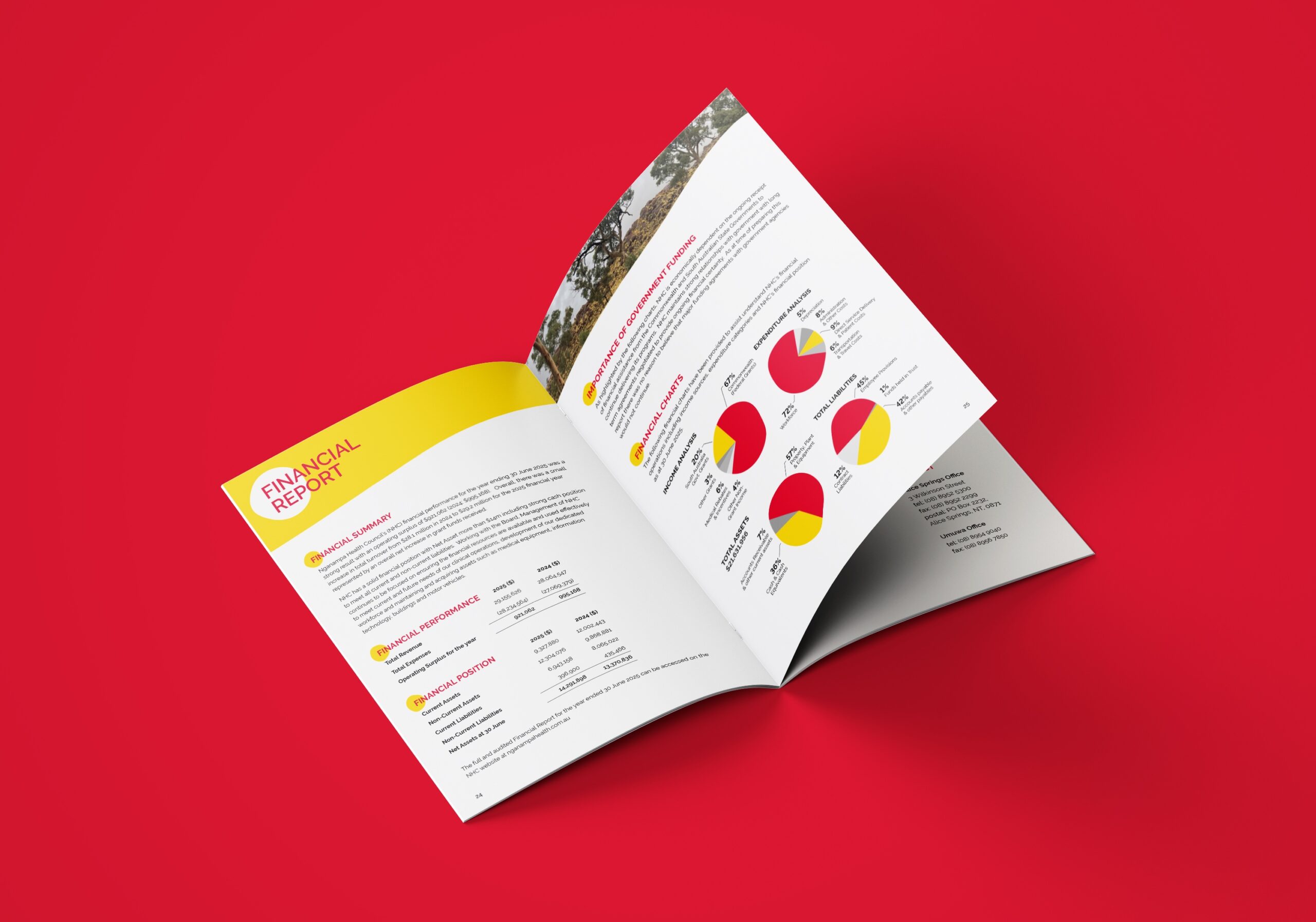
- Custom graphics for key health outcomes and service impact, making data intuitive and meaningful.
- Feature stories and profiles from community members and health practitioners.
- Culturally significant design elements, such as patterns, colour palettes and typography chosen with community guidance.
- Accessible formats, including print, web-optimised and plain-language versions.
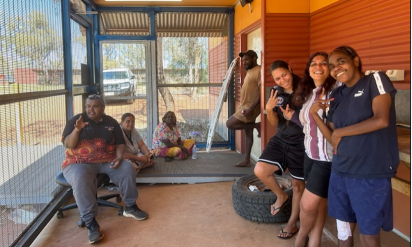
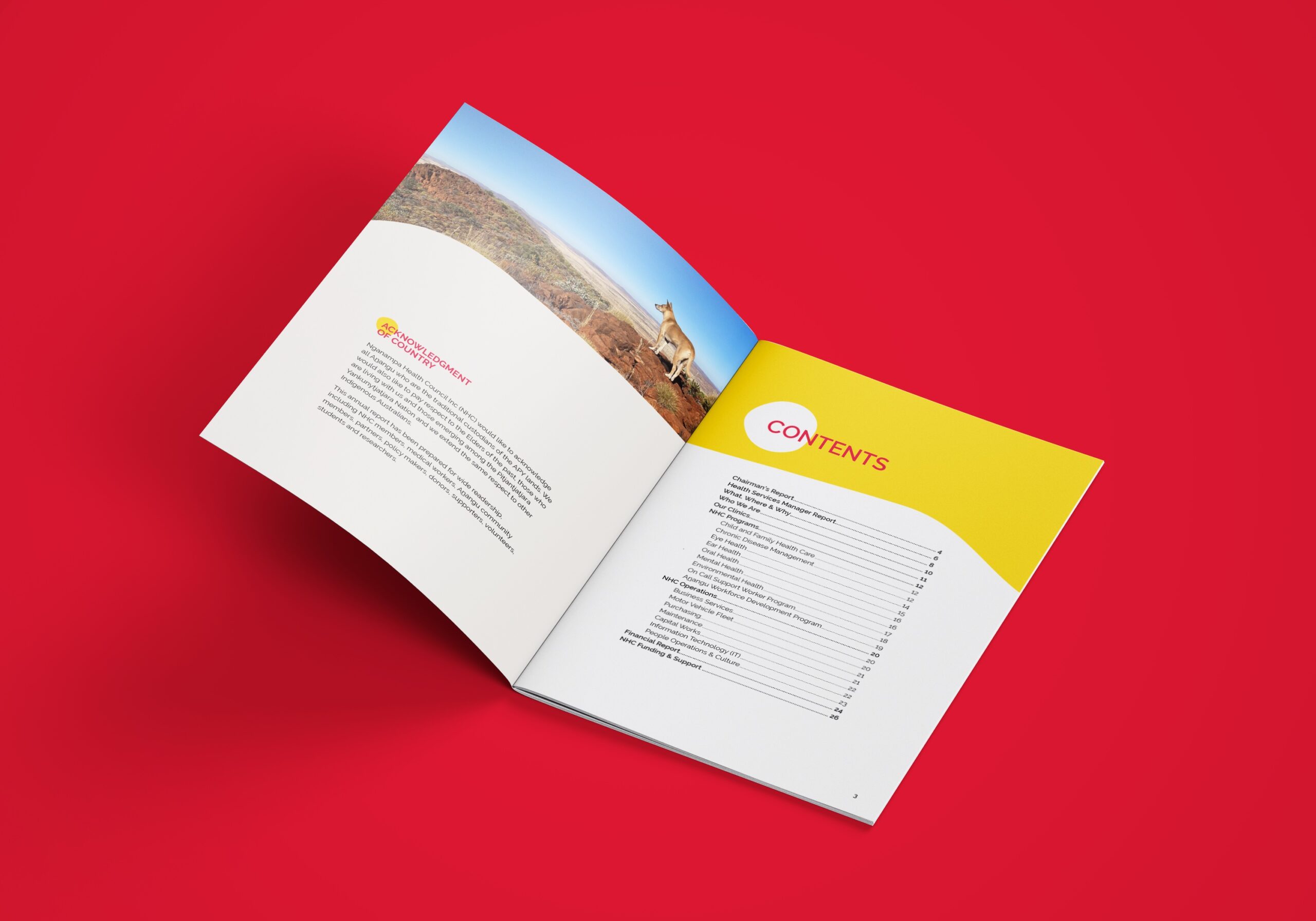
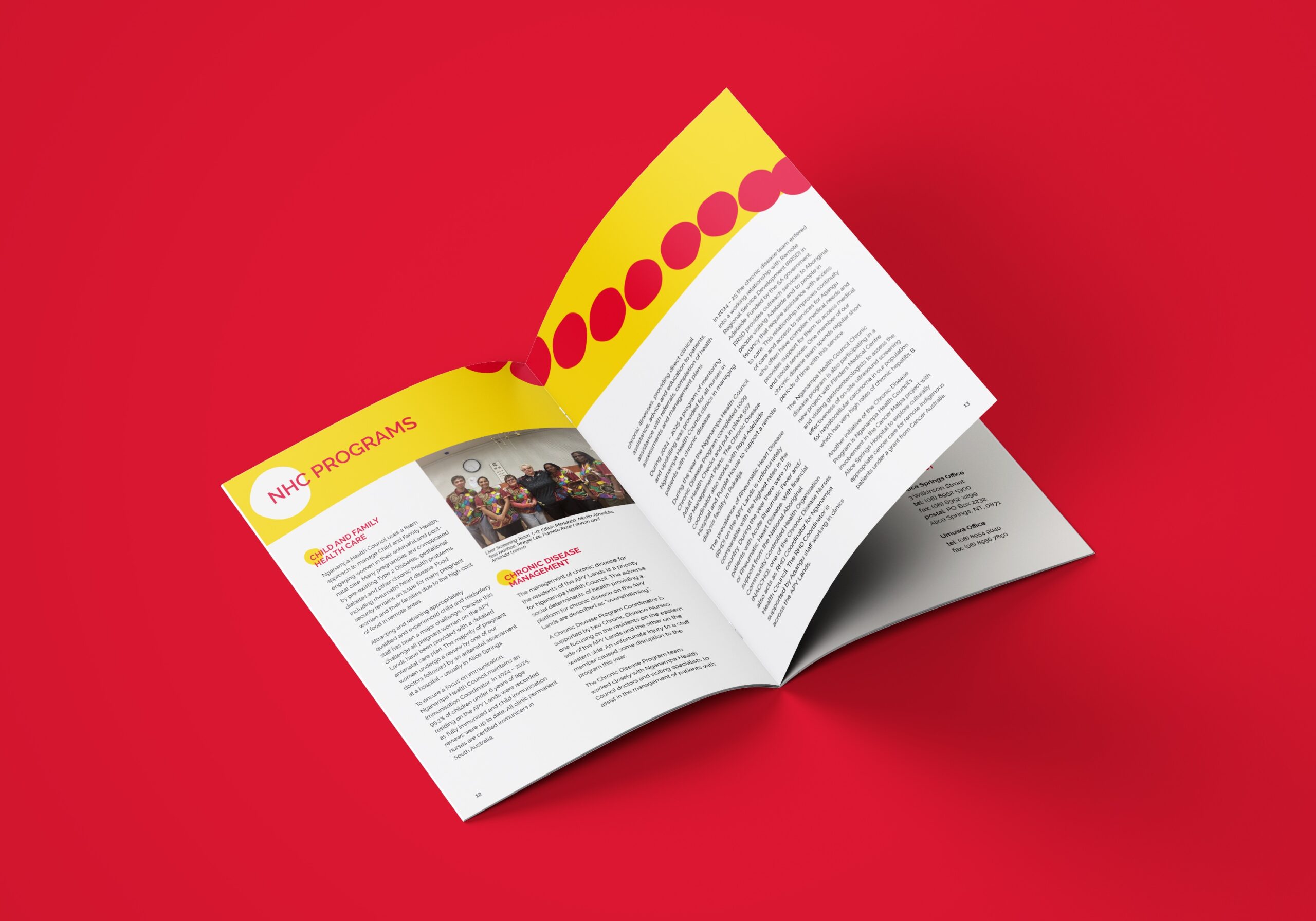
The report features stories and reflections from community members, health workers and program participants that highlight the real-world outcomes of NHC’s work. Our role was to support these narratives through thoughtful visual design, using imagery, colour and graphic elements to create a publication that feels grounded in community and place.
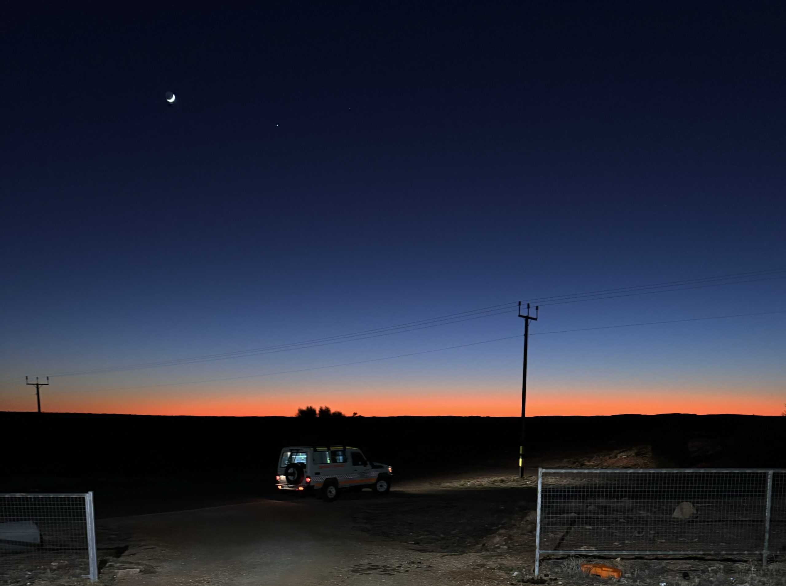
Photography was carefully selected to reflect the people, landscapes and services that shape everyday life in the region, helping situate the stories within the communities NHC serves.
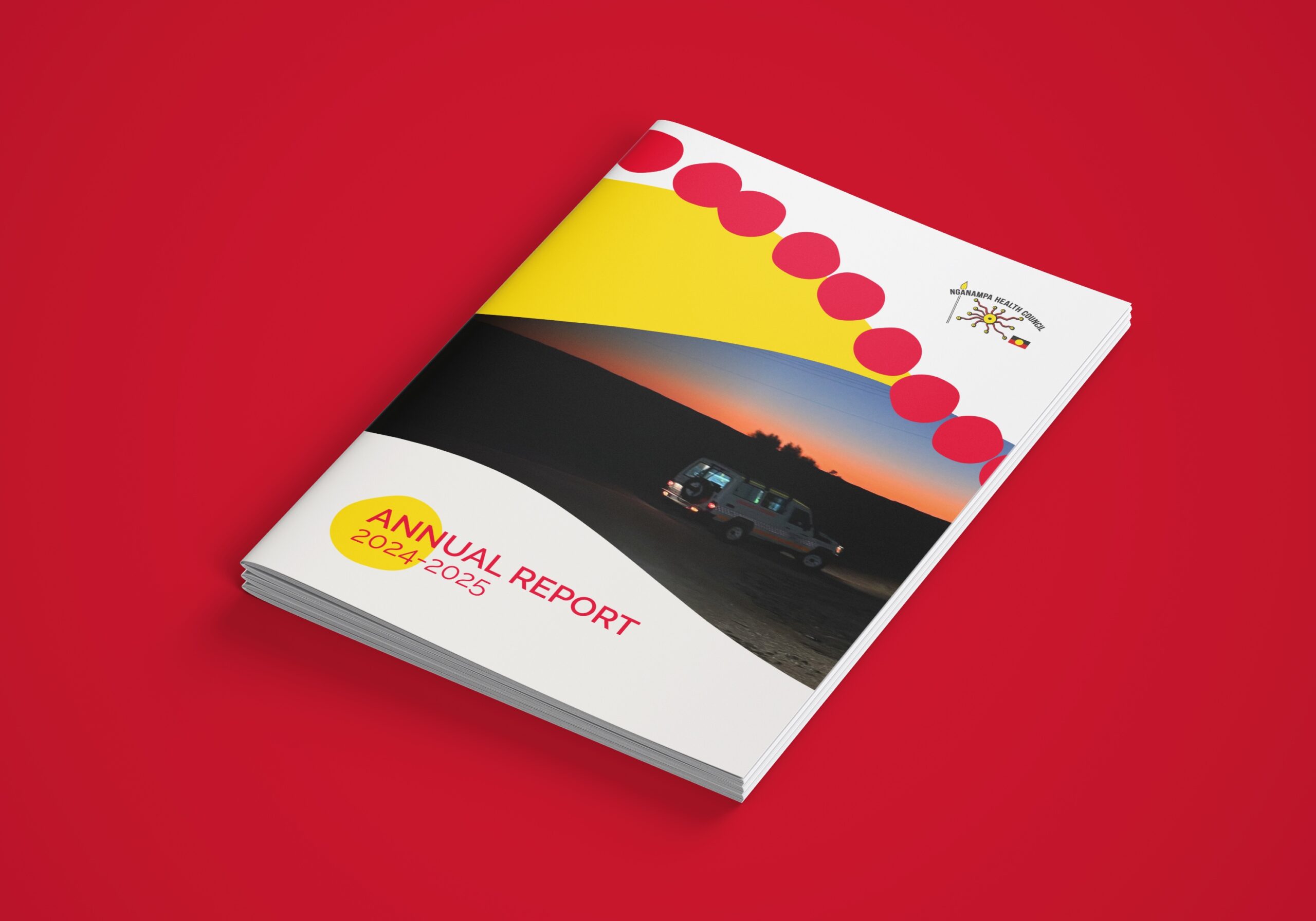
Colour plays a deliberate role in the visual identity of the report. The palette draws from the red, yellow and black of the Aboriginal flag, alongside white from the existing brand palette, creating a visual connection to both cultural significance and brand continuity. Rather than acting as decoration, these colours provide clear structure across the document, helping define sections, draw attention to key information and create a recognisable visual language that feels both purposeful and respectful.
Circular paint marks were used as a graphic element throughout the report, inspired by the base of a paintbrush and referencing the visual language of dot painting within Aboriginal culture. Rather than replicating traditional artwork, this approach was intended as a subtle and respectful nod to cultural storytelling, using simple circular forms to add warmth, create visual consistency and reinforce the strong community focus of the report.
Through the combination of considered imagery, a grounded colour palette and the use of organic shapes, the design supports the stories shared within the report and creates a cohesive visual narrative from beginning to end.
The final annual report provides NHC with a visually engaging, culturally grounded document that accomplishes multiple purposes:
Celebrates community-defined achievements.
Strengthens communications with funders and partners.
Offers a meaningful record for communities to share and reflect on.
Serves as a bridge of understanding between lived experience and organisational outcomes.
This resource will be used throughout the year to promote transparency, deepen engagement, and advocate for continued support of remote Aboriginal health initiatives.
- Art Direction
- Concept
- Design


